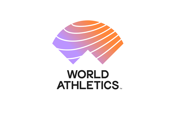
The IAAF, in a press release, introduced its new name and logo. The video below, and the press release below are the newest release on an amazing rebranding, the first after 107 years.
What does it mean? Too early to tell. Obviously, much money was spent on the branding study and managing the design. Truth is, the communication is aimed at the consumer, and media and potential sponsors.
Read the release, check out both of the videos, and take it all in.
The new logo of IAAF (short film)
IAAF UNVEILS NEW NAME AND LOGO |
 |
© IAAF |
The IAAF Council approved the global governing body’s new name and logo at the 217th IAAF Council Meeting which concluded today (8) in Monaco. The new name, ‘World Athletics’, builds upon the organisation’s restructuring and governance reform agenda of the past four years to represent a modern, more creative and positive face for the sport. The new brand, Council agreed, makes the sport more accessible to a wider audience while giving the global governing body the opportunity to more clearly communicate its mission as the leader of the world’s most participatory sport. “The hope is that our new brand will help attract and engage a new generation of young people to athletics,” said IAAF President Sebastian Coe. “We have now created a brand that can come to life in the digital world while reflecting the changing nature of the sport. And at the same time bring into focus the athletes, the heroes of our sport.” “The IAAF name has been in existence for over 100 years, but it has little understanding or relevance to those outside of athletics,” said IAAF CEO Jon Ridgeon. “The new identity creates a symbol that can stand alone and work with partners and events.” The new brand identity will begin its rollout in October after the IAAF World Athletics Championships Doha 2019 and following Congress’s approval of the change to the Federation’s legal name. The logo design is comprised of three main elements: the ‘W’ of World, which is also a symbol of an athlete’s arms raised in victory; the ‘A’ of Athletics, which also represents an athlete’s focus as they prepare for the road ahead; and an arc over both to represent the entire athletics community coming together. The logo also includes the sweep of a running track which appears in an upward trajectory, symbolising the desire to continually push beyond limits. The patterns capture the energy present in all four of athletics’ group disciplines: running, jumping, throwing and walking. The rebrand process began in January 2018 when the IAAF invited five global brand and marketing agencies to respond to the brief outlining the rebrand concept. From those, an internal team selected a short list, which then underwent a consultation process where Member Federations, partners, athletes and broadcasters provided feedback before the final version was presented to Council. The logo, a logo film, a brand narrative and other assets can be downloaded here. IAAF |
Author

Larry Eder has had a 52-year involvement in the sport of athletics. Larry has experienced the sport as an athlete, coach, magazine publisher, and now, journalist and blogger. His first article, on Don Bowden, America's first sub-4 minute miler, was published in RW in 1983. Larry has published several magazines on athletics, from American Athletics to the U.S. version of Spikes magazine. He currently manages the content and marketing development of the RunningNetwork, The Shoe Addicts, and RunBlogRun. Of RunBlogRun, his daily pilgrimage with the sport, Larry says: "I have to admit, I love traveling to far away meets, writing about the sport I love, and the athletes I respect, for my readers at runblogrun.com, the most of anything I have ever done, except, maybe running itself." Also does some updates for BBC Sports at key events, which he truly enjoys. Theme song: Greg Allman, " I'm no Angel."
View all posts


